ThirdLove – Improving Checkout Experience
May 2018 – Feb 2020 · 1 yrs 10 mos
About ThirdLove
ThirdLove is an American company specializing in bras, underwear, loungewear, and nightwear. It was the first brand to introduce trademarked half-cup sizing and a mobile app that empowers women to measure themselves at home.
My Role
I joined ThirdLove in May 2018. In my role, I led user research to uncover pain points, validated findings, and generated solutions that shaped an MVP. My focus was on creating experiences that not only solved user problems but also aligned with key business objectives.
The Opportunities
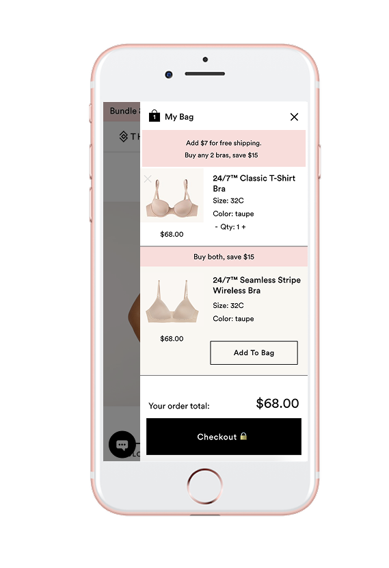
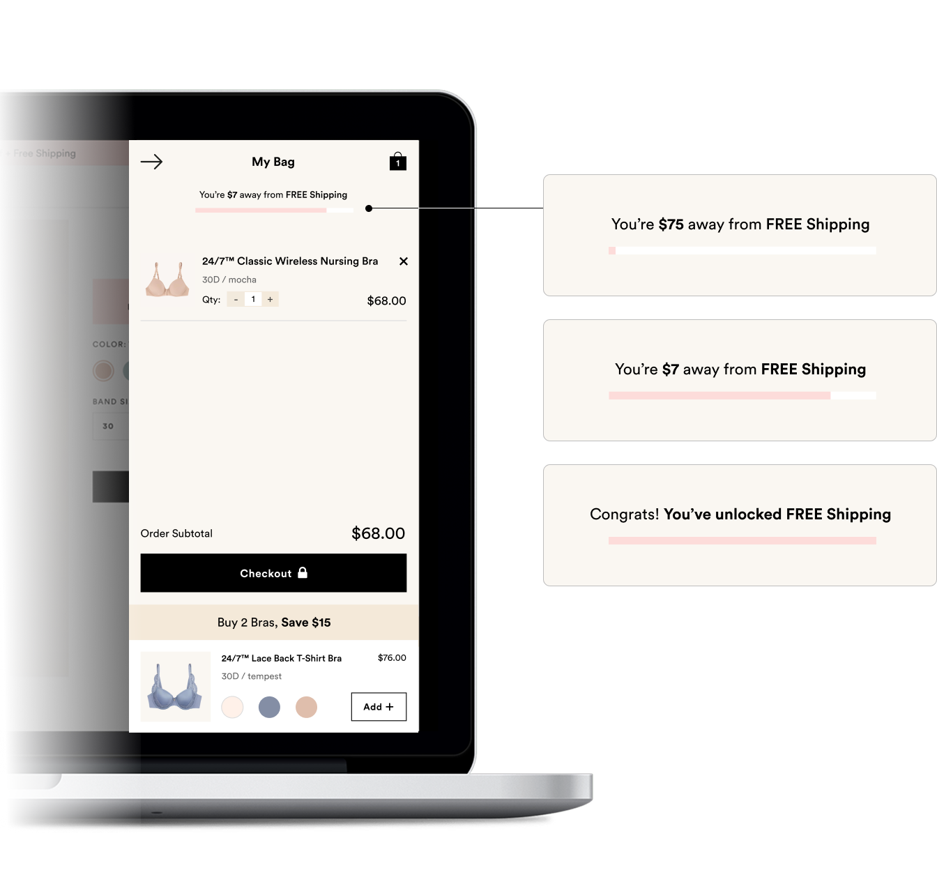
Free Shipping Message
Clarifying the Free Shipping Threshold with better content and visual hierarchy may encourage users to add more items to their cart.
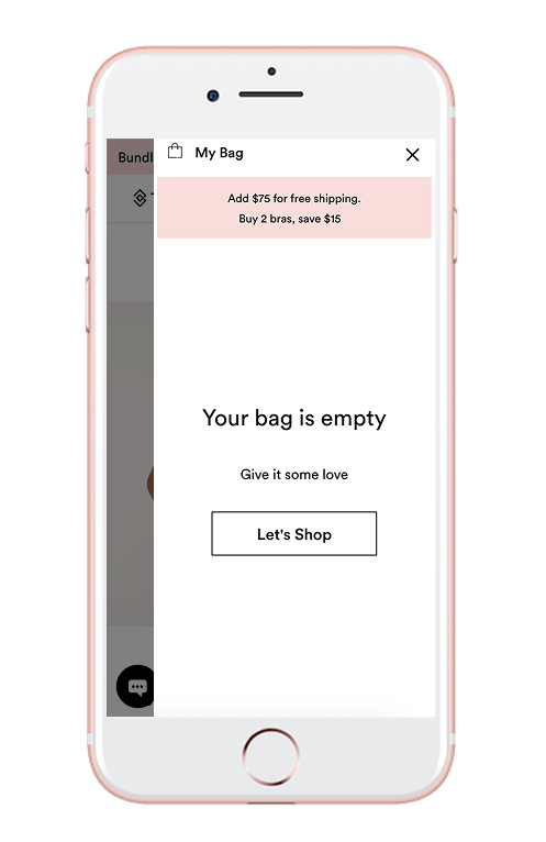
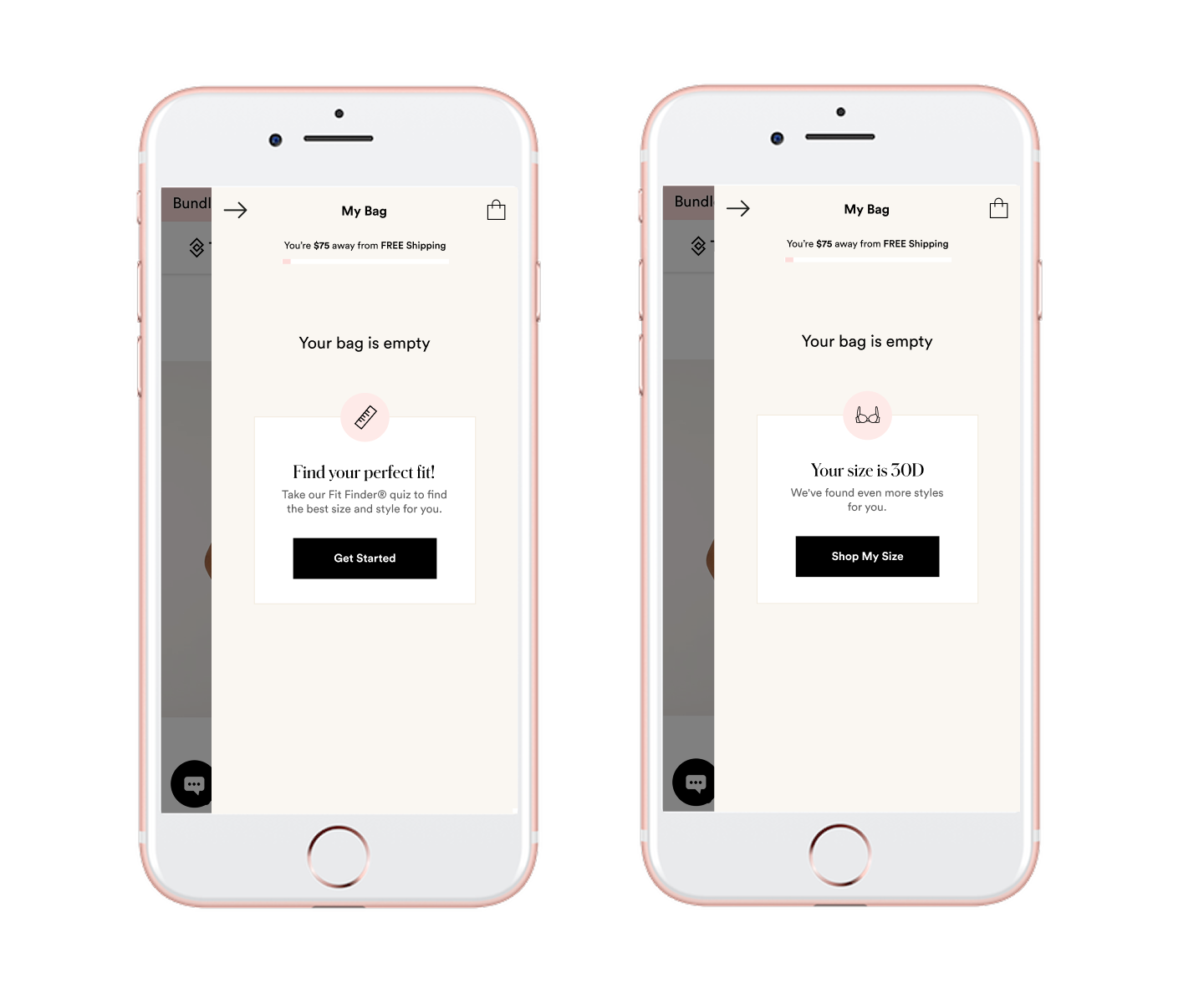
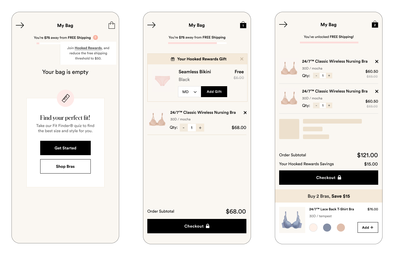
Empty Bag
Improving the messaging and call to action when the bag is empty could increase user engagement and click-through rates.
Delete Item Icon
The delete icon is faded by default and only appears on hover in desktop. On mobile, it stays faded, making it hard to spot—especially for users with visual impairments.
Quantity Indicators
The tap targets for adjusting item quantity are too small. The plus and minus icons aren’t touch-friendly, particularly for users with larger fingers.
Link to Product Page
Only the product title links back to the product page. The thumbnail isn’t clickable, which may limit intuitive navigation.
Updating Color & Size
Upsell items show preset color and size options based on the user’s previous selection. If a user wants to try a different variant, switching between options may be cumbersome.
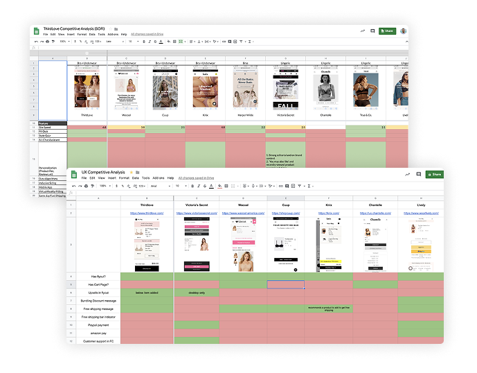
Competitor Analysis
To better understand the market, product landscape, and user goals, I conducted a thorough UX competitor analysis. This helped identify both direct and indirect competitors, uncover actionable insights, and inform strategic recommendations.
The main objective was to pinpoint what our flyout cart was doing well (or not), and use those findings to craft a more seamless, intuitive experience.
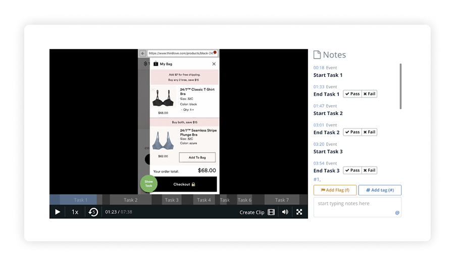
Usability Testing
To validate design decisions and uncover usability issues early, I conducted two moderated usability testing sessions using Validately (Now User Zoom, one focused on mobile users, and another on desktop. The goal was to gather qualitative insights by observing participants as they performed key tasks.
Each session was designed to surface friction points, assess the clarity of interactions, and understand user expectations. While the sample size was intentionally small (5 users per platform), it provided valuable directional feedback to refine the experience. Given the exploratory nature of this phase, I prioritized behavioral observations and spoken feedback over quantitative metrics, allowing me to iterate quickly and with purpose.
Pain points found

Remove Icon Lacks Visibility
Users often missed the dedicated remove item icon and instead used the quantity minus (–) button to delete products, indicating a visibility and affordance issue.
This caused unintentional behaviors that disrupted the shopping flow and often led to confusion about how to remove an item properly.
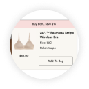
Upsell UI Creates Confusion
The upsell module closely resembled a regular cart item and was placed directly below the added product, leading users to believe they had added two items instead of one.
The visual similarity made it difficult for users to distinguish between core actions and promotional content, weakening trust and clarity.
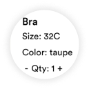
Lack of In-Cart Edit Options
Users expressed frustration at not being able to modify size or color directly within the cart or upsell section. They found it tedious to return to the product detail page (PDP) for simple changes.
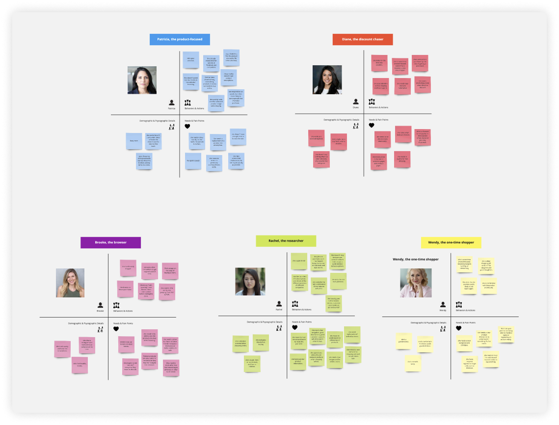
User Personas
We identified five distinct user personas, each representing a unique buyer profile with specific goals, behaviors, and pain points. Their shopping journeys differ: from how they navigate the site to what they prioritize when making decisions.
Understanding these differences is essential to crafting an inclusive e-commerce experience. By designing with clear user intents in mind, we ensure the interface supports each shopper’s path, improving both satisfaction and conversion.
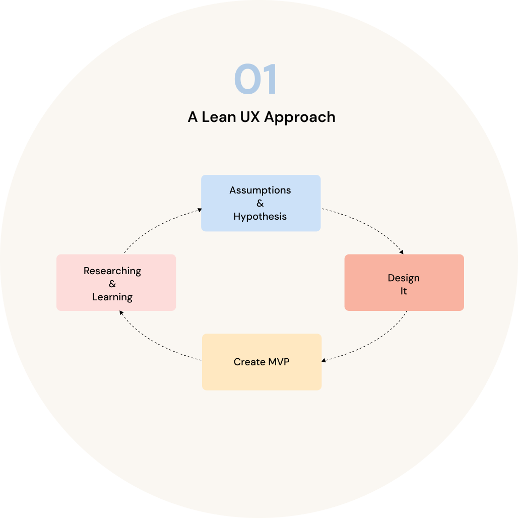
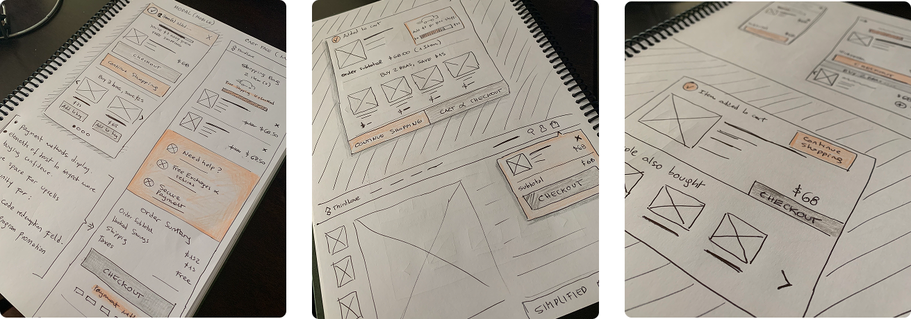
Sketching Ideas
Before jumping into high-fidelity designs, I started by sketching quick ideas on paper to explore different layout directions and interaction flows. This helped me clarify the structure, prioritize content, and identify potential usability challenges early on.
By staying low-fidelity, I was able to iterate fast, focus on information architecture, and validate core concepts before investing time in visual polish. These early sketches laid the foundation for more refined wireframes and allowed for efficient feedback and alignment with stakeholders.
User Flow & Wireframes
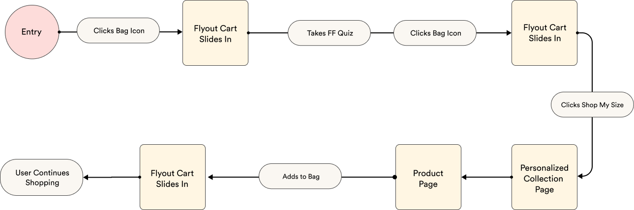
After sketching out early concepts, I defined user flows to visualize how different personas would navigate the experience from entry point to goal completion. This helped surface potential friction points, streamline interactions, and ensure the structure supported each user’s intent.
I then created a set of low-fidelity wireframes focused on layout, hierarchy, and UX clarity rather than visual polish. These wireframes were intentionally minimal to encourage feedback on the overall direction rather than UI details.
Sharing these with stakeholders early in the process was key. It allowed us to align on user goals, validate core ideas, and make confident decisions about which direction to pursue before investing in high-fidelity design.
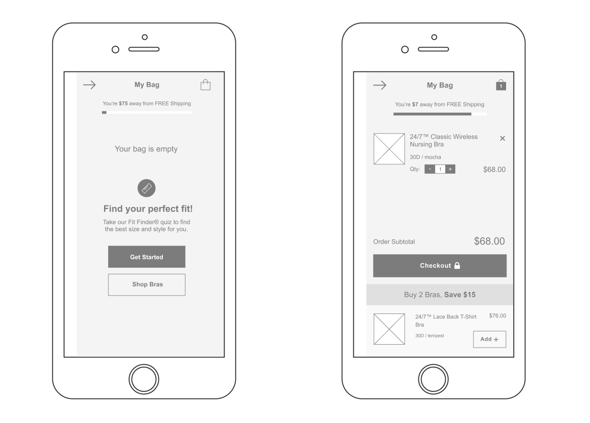
The MVP
Fit Finder Quiz Module
Data showed that users who completed the Fit Finder quiz had significantly higher conversion rates. To leverage that behavior, I replaced the generic “Continue Shopping” CTA with a Fit Finder module. This gave users a personalized path forward immediately after the quiz, creating a smoother transition and a more tailored shopping experience. The goal was to turn insight into action and use UX to directly support business outcomes.
Free Shipping Progress Bar
To encourage higher order values, I introduced a dynamic free shipping progress bar. It gives users instant feedback on how close they are to unlocking free shipping. Instead of a static threshold message, this progressive indicator adapts as users add items, creating a subtle nudge to continue shopping. This small addition has the potential to drive meaningful impact on average order value without adding friction to the experience.
Remove item icon was placed to the right, outside of thumbnail
Now it’s easier for users to spot and tap the icon. In the previous version, it blended into a dark pattern and often went unnoticed.
Product recommendation was moved to the bottom
Placing it at the bottom avoids confusion with cart items. The distinct layout and color scheme help clearly separate it from the rest of the content.
Edge Cases
Design isn’t just about the happy path. I defined edge cases like empty states, loading experiences, tooltips, and error handling to ensure a robust and polished product. I also considered how additional flows, such as the rewards program, would integrate into the bag experience without creating friction. These details help reduce confusion, build trust, and create a seamless user experience no matter the scenario.
The Outcome
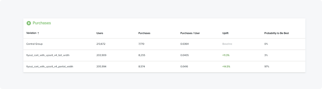
We A/B tested the control (original flyout cart) against a full-width variation on mobile. Surprisingly, the full-width version underperformed. After reviewing the data, we introduced a third variation: a partial-width layout with updated colors.
This new approach showed promising early results. After a couple of weeks of testing, the partial-width variation outperformed both previous versions. It struck the right balance between usability and visual clarity — leading to measurable improvements.
Here’s what we observed:
13% Increase in Revenue
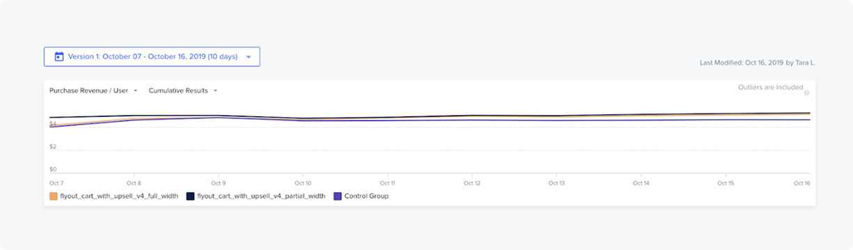
14.9% Increase of users that hit the checkout button
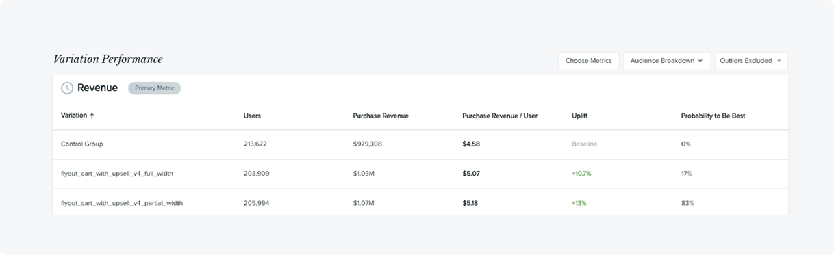
14.5% lift in purchases